Why it's time to ditch PowerPoint and master the art of the truly visual presentation
PowerPoint may have been a gamechanger back in the 80s. But in the intervening years, the game has moved on so far that presenting a crucial pitch with PowerPoint is a little like playing the Wimbledon final with a wooden racket. There's no shortage of evidence to suggest that, if you want to win over your audience, PowerPoint isn't the right tool for the job. And there's no shortage of alternatives to PowerPoint - from interactive rich pictures to bespoke animation - that are fit for purpose today.
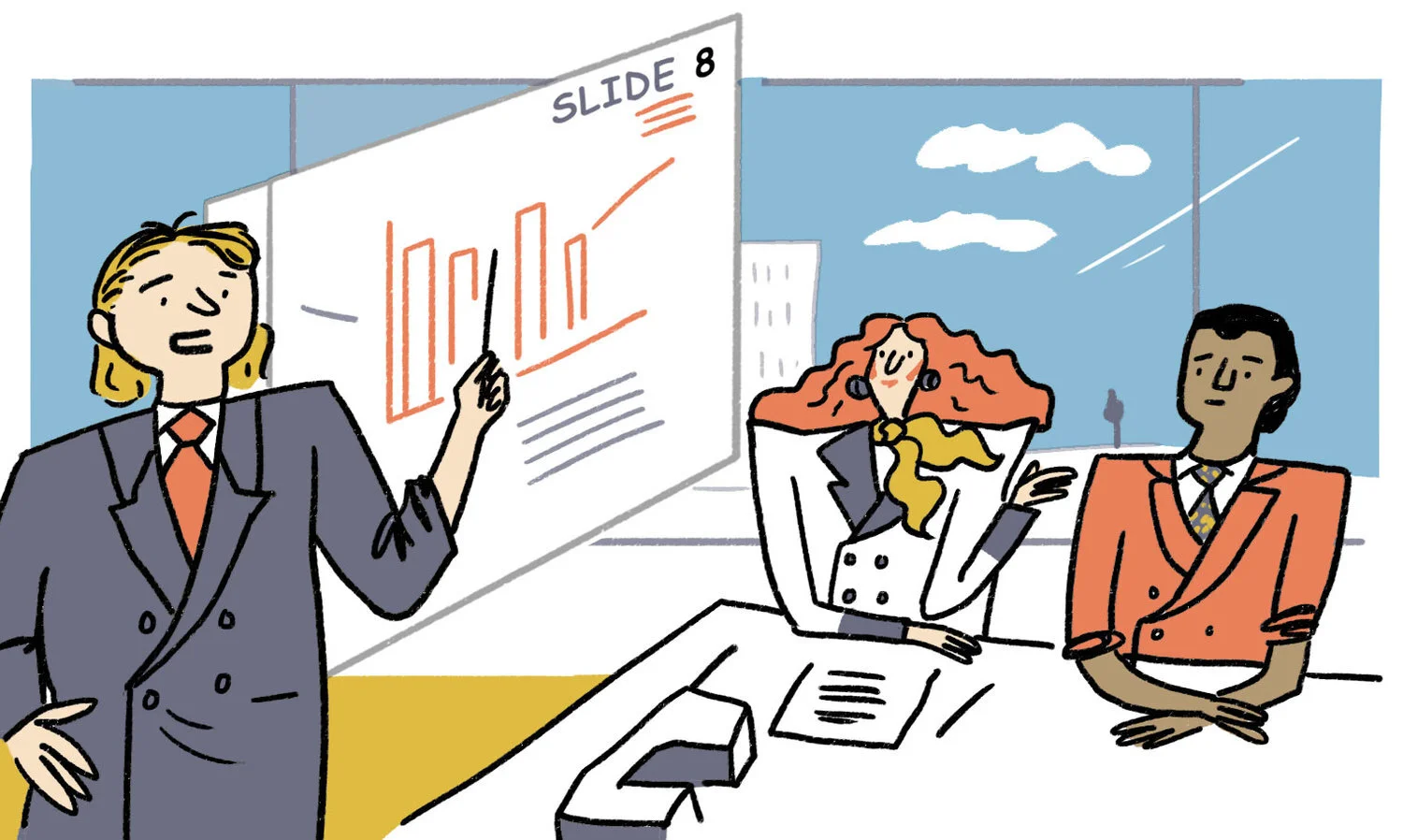
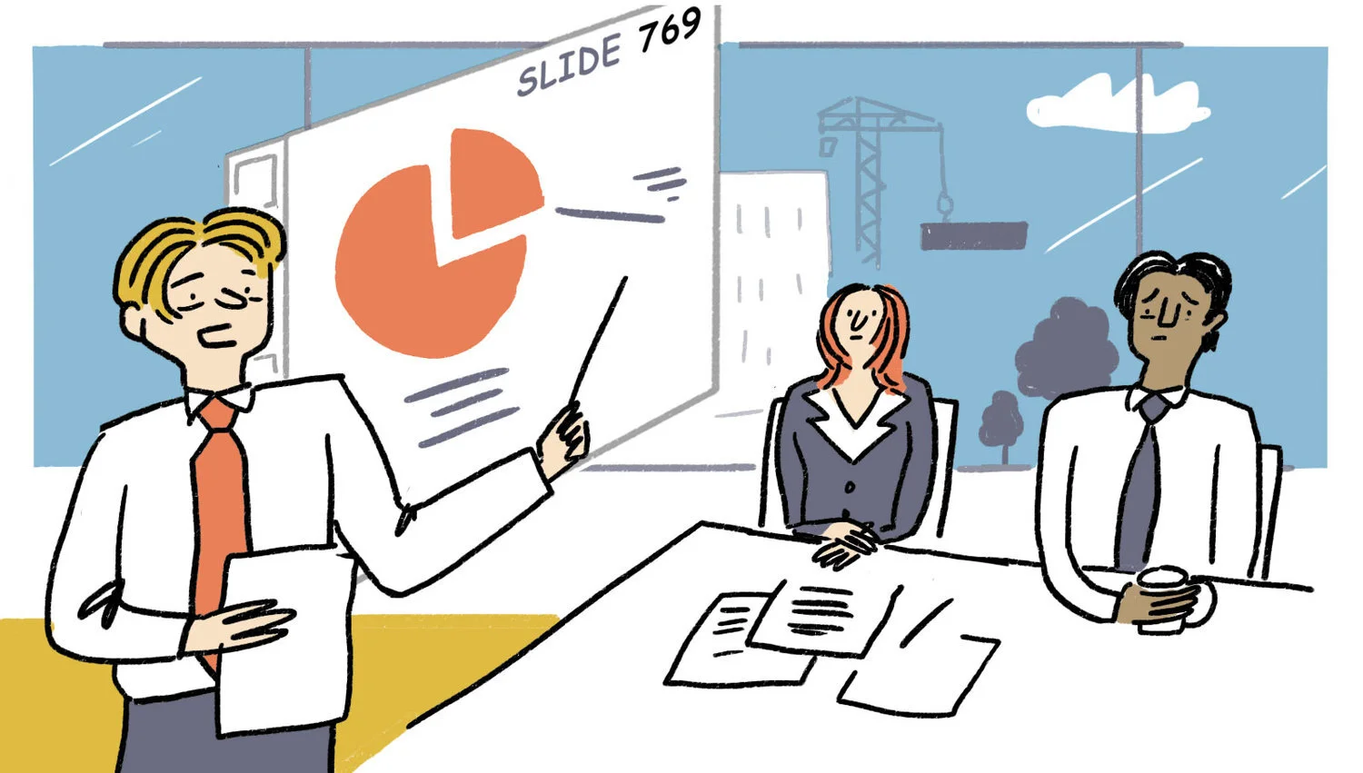
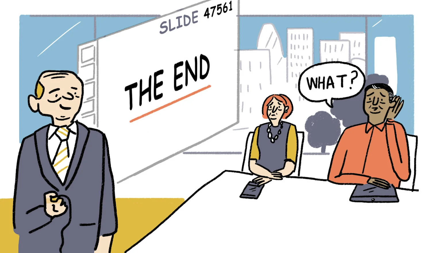
"Death by PowerPoint" is an all too common fate. In airless boardrooms and soulless conference centres everywhere, it's easy to spot those who have succumbed: mouths agape, eyes wandering and, in some tragic cases, full physical and mental inertia.
Since its release in 1987, PowerPoint has maintained an impressive grip on our presentation habits, with Microsoft estimating that there are 30 million PowerPoint presentations made every day. It's true to say that, for many, 'PowerPoint' is synonymous with 'presentation'.
But a lot has changed since the 80s. Not least our understanding of what makes for persuasive communication. In recent years, methods of marketing have changed completely to reflect what we now know to be fact: that a two-way dialogue is a far more effective means of persuasion than a one-way broadcast. Yet, with PowerPoint presenters continue to broadcast, and audiences continue to switch off.
If you're a PP-devotee, you may feel a little nervous about stepping away from your trusty bullet points. But, read this run down of research, and you may find you too are unconvinced of its power and its point.
Our brains don’t work in linear bullet points
For Matthias Poehm, a Swiss software-engineer-turned-public-speaking-coach, PowerPoint is anathema. To the point that he founded a political party to see rid of it.
The Anti-PowerPoint Party believe that slideshow decks are so useless that they actually inflict real damage on our global economy. PowerPoint wastes worker's time, they say, because it conveys information poorly and teaches people very little. Poehm believes we could save €350bn globally by killing off the software for good.
And Poehm isn't alone in his criticism of PowerPoint. Though slideshows have long been ingrained in the American military as a way of communicating strategic information, you won't struggle to find enemies of PowerPoint in the ranks.
Brig Gen.H.R.McMaster, who banned PowerPoint presentations when he led the effort to secure Tal Afar in 2005, has likened PowerPoint to an internal threat. He claims: ‘It’s dangerous because it can create the illusion of understanding and the illusion of control.’
Complex military operations - with all their interconnected political and economic factors, different units and carefully co-ordinated movements - are not neatly linear. They are multi-dimensional, or as General McMaster puts it, 'some problems in the world are not bullet-izable.'
But when the objective is to not impart important information, retired Marine Colonel Thomas X. Hammes jokes that PowerPoint comes into its own. He said that briefing the news media via mind-numbing PowerPoint presentation was likened to "hypnotising chickens".
Your day-to-day work life might not involve making life or death decisions. But regardless of your industry, every organisation needs a clear route through un-bullet-izable challenges, and every organisation needs a presentation style that's fit for purpose.
Make it move
Our brains are far more receptive to information when it's laid out spatially. And that's because we have a 'ventral' visual system, that processes information like colours and shapes, and a 'dorsal' spatial system, that deals with things like location and distance. When both of these systems are put into use - say, through animation or rich pictures - it boosts our memory and our understanding.
New research from the Harvard Department of Psychology's Decision Science Laboratory found animation to be the best way of engaging audiences. Their researchers ran an experiment to identify which mental mechanisms are at the root of effective communication in presentations. Testing the same presentation in three styles – PowerPoint, Prezi and oral presentation – Prezi, a software that lets you interact with visuals and move around slides, emerged victorious, which Harvard attributed to its use of zoomability and animation.
As Fast Co Design's Meg Miller notes: ‘When a presentation was judged as lacking in animated elements, it was almost always rated poorly.’
Working with our clients we've seen for ourselves that the power of presenting information in a more dynamic format can really help people engage and understand dry or complex subjects.
Rich pictures work as a fantastic basis for a presentation, allowing presenters to zoom in and out of different parts as their presentation moves from point to point. Our clients have found that mapping out their ideas visually offers a really flexible presentation aid, that comfortably contains a number of interlinked narratives. And that same visual map can be used by different colleagues, or for different presentations, to highlight different areas of focus within the same coherent picture.
What’s more, Harvard’s experiment also found that the use of animated content within presentations can help to impart intelligence and authority to whoever is presenting. Participants in the study rated presenters as ‘more knowledgable, professional, effective and organized than other presenters’, but crucially noted that this was solely due to the animated presentation, not because of the quality of the presenter.
We learn by doing
In our networked world of likes, comments and shares, interactivity is key to engaging an audience.
And that's why Meg Beckum, creative director at brand engagement firm, Sullivan, advises: ‘Don’t treat a presentation like a brochure. For the most part, people aren’t reading the slides. You want to start a conversation and have a dialogue.’
According to Professor at Copenhagen Business School, Bent Meier Sørensen, 'death by PowerPoint begins with the first bullet'. He has stopped using PowerPoint all together, noting that the software was first targeted at consultants and busy salespeople. This sales-approach, he believes, has a ‘toxic’ effect when you’re trying to teach and inspire students; they copy your notes word-for-word with no real engagement or understanding.
‘The basic problem is that a lecturer isn’t intended to be selling bullet point knowledge to students, rather they should be making the students encounter problems,’ Sørensen says. He’s taken to using chalk and blackboards that allow for improvisation and deviation from students.
Civilla, social innovation organisation, boycotted PowerPoint, too, after being tasked with finding a more engaging and human-centered way to present their data on Michigan’s public benefit system.
‘[PowerPoint] establishes a power structure that is less relevant in today’s networked world, with the subject matter expert speaking at the front of the room and the audience passively receiving information’, says Michael Brennan, Civilla's CEO and co-founder.
Instead of asking their audience to learn by listening, they asked them to learn by doing. They used foam duct, fishing lines, papier–mâché and the like to create a large installation that connected with human senses and presented information in a humanising, meaningful way. They concluded that, 'When we ditched PowerPoint, we created something that was able to speak to both the head and the heart.'
And this is something we can back up, too, having seen teams come to life when they're given the freedom to draw or build their problems in our visual storytelling workshops. We've even brought Lego to workshops in the past, which helped Heathrow Airport come up with a metaphor for an internal animation.
One facilitator we work with has even been know to use pieces of cake as a medium for building hypothetical business models with his clients. It might sound crazy, but it's undeniably memorable and stimulating for the senses.
Next week’s analytics presentation might not seem worthy of your own Great British Bake Off Showstopper, but take note: presentations that involve the audience and engage the senses are, as Brennan points out, 'more memorable and thought provoking and foster empathy'.
Innovative, interactive, appealing and engaging methods of presentation is what Scriberia is all about. Though illustration, scribing and animation we offer a flexible range of options to capture your ideas and captivate your audience. Contact the team to let us know how we can help you.


