Visual storytelling: The new frontier of editorial
As more and more digital publications turn to visual communication - from editorial illustration to mixed-media animation - to tell their stories, we explore our favourite examples from the vanguard of visual journalism.
Streams of memes, listicles upon listicles; it's not often that digital journalism is associated with the raising of editorial standards. The distant days of healthy print circulations are more usually regarded as the golden age for both written and illustrated content.
But, now that everyone is in the business of content publishing, a quantity-over-quality strategy - built on stock imagery and thin concepts - is starting to look a little risky. In any crowded market, the key to surviving and thriving is distinguishing yourself from the competition. And it's noticeable that those publishers with the greatest financial and creative resources at their disposal are doing just that by exploring and experimenting with the new creative possibilities that digital publishing offers.
For us, it's exciting to find more and more examples of visual storytelling online - published in the digital pages of the old stalwarts of print. For them, these specially commissioned illustrations and animations that don't just support, but are intrinsic to the piece, push boundaries and, crucially, attract and engage an audience far more effectively than stories told in text-heavy formats. It's further evidence of the power and potential of visual storytelling in all kinds of contexts. Here are just a few of our favourite finds from the vanguard of visual journalism.

An image from WIRED's The Hotel Room Hacker
WIRED recognise that clicks, reads and shares are dependent on impactful visuals. And, so, they increasingly commission eye-catching illustrations, animations and gifs for their online articles.
The Hotel Room Hacker is a brilliant example of visual innovation at its best. The piece catches its reader's attention with a beautifully animated illustration, and then keeps them engaged with animated gifs, photographs, videos and maps peppered throughout.
Shannon Perkins, previous Editor of Interactive Technologies at WIRED, explains: 'It's the visual style, the visual treatment of the piece that engages the user and keeps them and makes them want to go tell their friends about it because it looked cool and it felt cool to them emotionally.
'Our emotions are so driven by those colours, by those images. So it has to come first - without the emotional hook, you're never going to get to the learning which is really the heart of it.'
The online editorial team at MR PORTER have a similar approach to their online journal, which has received an approving nod from the design gurus at It's Nice That: 'What we love about the Journal is the commissioned content: every well put together article is backed by an exclusive piece of exquisite illustration, film or photography to give it extra weight.'
Former Editor, Jodie Harrison, explains: 'Illustration is a wonderful tool that has become part of our editorial DNA. We all grew up reading and enjoying the illustrations in titles such as The New Yorker and Vanity Fair. There was something beautiful and nostalgic about bringing that art form onto a minimal and modern platform. I just loved the idea. At the start we worked with just one or two illustrators but have a great pool of illustrators that we use regularly.'
'Our lovely, brilliant creative team are always on the hunt for new illustrative talent and we have even had an in-house illustrator. We try to assign different artistic styles to different articles so that the pace and tone switches with each, and they gain an identity. We also try to only feature one or two illustrated stories per issue so they feel special', Jodie says.
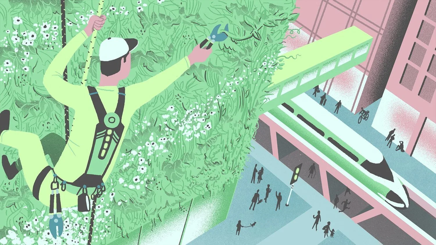
'Vertical Gardener' illustration taken from MR PORTER's piece, 'Six Jobs Of Tomorrow To Train For Today'
Visual content: no longer a side show
In their 2020 Report, the New York Times note how their most poorly read stories are those 'with minimal added context, without visuals and largely undifferentiated from the competition.' The first major aim within the report is to become more visual, in the belief that, 'digital storytelling tools [...] allow for richer and more engaging journalism.'
Their commitment to establishing a visual voice has been impressive so far; their long-form visual story, Snow Fall, was the first of its kind, introducing readers to an immersive reading experience. Graphics director, Steve Duenes, describes the style of the story as, 'not just text plus visual elements that are bells and whistles, but a more cohesive framework.'

The title image from the New York Times' Snow Fall feature
While Deputy Director, Digital Design, Andrew Kueneman, says: 'We all are very curious about what's happening with non-traditional reading experiences. Pitchfork has done them; ESPN has done them before, running these full screen pieces with lots of media, I think there is a lot of inspiration out there.'
The 2020 report commits to expanding, 'the number of visual experts who work at The Times and also expand the number who are in leadership', in a bid to, 'move away from traditional, print-focused roles and toward new, multimedia-focused roles, line senior visual journalists shaping both the form and content of coverage.' With a whole host of new talent poised to enter the newsroom, the Times are redefining journalism as we know it.
The Guardian, too, have been focusing more on digital illustration. As Creative Review put it: 'The Guardian (like many media organisations post The New York Times' seminal online feature Snow Fall) has been experimenting with interactive stories on its site, which bring together film, audio, animation, photography and text in a rich mix of storytelling.

The Guardian's illustration for Harper Lee's Go Set A Watchman launch
'Whereas in the past a big story would have been led by print, now these pieces will be commissioned with a 'digital first' ethos. For example, a recent major feature for the launch of Harper Lee's Go Set A Watchman included an illustration that was commissioned primarily for online, but which needed to be scalable for use in print too.'
We're proud to have worked with the Guardian on several of their forays into animated content, from the Made Simple series to the 60 Second Climate Fix. But other British newspapers are on the case, too. These days, you'll find a director or an editor of visual journalism in almost every modern newsroom (and we wrote about some of our favourite examples of their work here).
Over at the Washington Post, they don't simply want to post more video, they want their videos to drive the narrative of their stories. Micah Gelman, director of editorial video, says: 'We've been moving over the last year, year and a half, to make sure our videos are much more an integral part of the storytelling that we do for the Washington Post overall.
'We don't have videos that stand alone without supporting text or photos or graphics, we don't have orphan videos that we just do because we like them but don't fit in with the rest of the journalism.'

The title image from Washington Post's Raising Barriers: A New Age of Walls immersive feature
Their stand-out piece, Raising Barriers: A New Age of Walls, was heaped with praise for its use of video and interactive graphs.
Kat Downs, graphics director, reflects on the piece to Journalism.co.uk: 'I feel like we did it. We finally created something that was not a text story with assets inside of it, or a video with a little bit of text written to it, but truly a story that depends on all of these pieces to communicate something.' Watch it here.
The artist’s lens: a fearless focus on image
National Geographic has long been celebrated for its boundary-pushing photography, documenting some of the most breath-taking pockets of the globe. But recently, it's been bolder still in exploring new styles of visual communication.
Christoph Niemann's illustrated travelogue of the North Pole is a personal favourite of ours. He embellishes awe-inspiring photography, for which the National Geographic is famous, with his own style of illustration and animation. Niemann's annotations provide charm and wit, to create a highly original and personal visual story format.

Christoph Niemann's Illustrated Travelogue to the North Pole for the National Geographic
Jill Cress, chief marketing officer at National Geographic, says: 'It's all about pushing the boundaries of visual storytelling through media properties. You need an unrivalled sense of purpose.
'Time is the most precious commodity for all of us. We have to think hard about the content we create. Content that sparks curiosity and creates the perfect moment of pause for consumers to remind them about what really matters,' she explains.
Take a look at our illustration and animation pages to see how our range of visual storytelling services could transform your online editorial.